How can we help?
Thank you for your enquiry, we will be in touch.
Oops! We could not locate your form.
Now that we’re back in the office – and presenting in person more again, hooray! – many of the old bad habits are popping up again. Already, many of us are suffering from ‘Death by PowerPoint’. You may even have been guilty of perpetrating it.
PowerPoint presentations have become a cultural norm; as soon as we hear we’ll be presenting, we jump straight into slides, not stopping to consider what our objective is or what our messaging needs to be. The result is often a visual deck with no link to any underlying point or intention. Other symptoms include boring, time-wasting presentations, less credibility and poor-quality communication.
However, all is not lost. As with most things, it’s not visual aid software that’s the problem – it’s how we use it. It’s possible to mitigate the risks of ‘Death by PowerPoint’ for our presentations, and ourselves. We do this by considering both context and content.
Cures for context
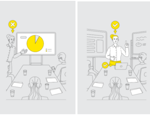
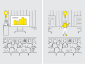
Think about the physical spaces in which you’re presenting – the boardroom or training rooms. In my experience, most are biased toward displays of slides rather than human connection.
There’s a long rectangular table with chairs around it. At prime position at the head of the table is a giant screen – dominating the spot where a presenter should be. Most screen positions push the presenter off to the side. One guess what this tells an audience about where the most important information is going to be coming from…
The first cure is kicking your slideshow to the side and taking centre stage.
Cures for content
Too many presenters design their slides as documents, rather than visual aids. In jumping straight to their slides, their visual deck develops as they’re working out the content itself. Take a beat and begin constructing your slides only after you have your big idea and core content sorted. This way you’ll have a greater chance of creating slides that aid your message, rather than just repeating it.
Other tips for designing great slides include:
Keep up to date with the latest tips and resources by joining our mailing list.
